

A mobile usability audit finds the problems that stop people from reading, navigating, and completing tasks on a phone. The useful version does more than run one Lighthouse report. It combines a representative URL sample, crawl evidence, lab diagnostics, real-user data, and manual accessibility checks, then groups repeated failures by template so the team can fix and validate them.
Mobile usability is also not the same as mobile-first indexing. Google primarily uses the mobile version of a page for indexing, but a page can preserve its search signals and still be frustrating to use. Audit both contracts: can search systems access and understand the mobile page, and can a person use it without fighting the layout or controls?
Define What the Mobile Usability Audit Must Prove
Start with a testable question, not a sitewide score. A redesign audit, a checkout investigation, and a content-template review need different samples and owners.
| Audit job | Best URL sample | Evidence that matters first |
|---|---|---|
| Redesign or release QA | Changed templates plus high-value control pages | Before-and-after renders, viewport behavior, navigation, layout stability |
| Organic traffic decline | Affected landing pages grouped by template and date | Mobile crawl changes, field trends, rendering, content and link parity |
| Ecommerce conversion friction | Product, collection, cart, search, and form states | Tap targets, overlays, input behavior, loading, sticky controls |
| Editorial quality check | Articles, hubs, category pages, and embedded media | Reflow, readable content, navigation, media dimensions, interaction costs |
| Accessibility remediation | Representative controls and page states across templates | Keyboard and touch access, target size, focus, zoom, reflow, labels |
The Screaming Frog tutorial that surfaced this opportunity shows how Lighthouse checks can be collected at crawl scale. The information gain here is the decision layer around that collection: how to combine different evidence types, separate indexing from usability, find the template owner, and prove the live fix.
Build a Representative Mobile URL Sample
Auditing every URL with the same intensity creates noise. Start with a sample that covers page types, business value, traffic, and risk.
Include at least:
- The highest-value page from each important template.
- One typical and one worst-case URL from the same template.
- Pages with long titles, wide tables, dense navigation, forms, media, ads, or embedded tools.
- Recently changed templates and components.
- Pages with poor mobile field data or user complaints.
- A few healthy control pages so the team can distinguish sitewide problems from isolated failures.
Use a smartphone viewport and mobile rendering context for the first pass. Then compare desktop only where it helps explain a difference. The separate mobile-first indexing checklist is the right workflow for content, metadata, canonical, robots, structured-data, and internal-link parity. This audit goes further into interaction, reflow, accessibility, and real-user experience.
Google's mobile-first indexing guidance says the mobile version should expose equivalent important content and search signals. Do not turn that into the false conclusion that parity proves usability. A mobile page can contain the same content while placing it behind an intrusive overlay, cramped control, unstable layout, or broken responsive component.
Stack Crawl, Lab, Field, and Accessibility Evidence
No single tool can prove mobile usability. Build an evidence stack in which each source has a clear job.
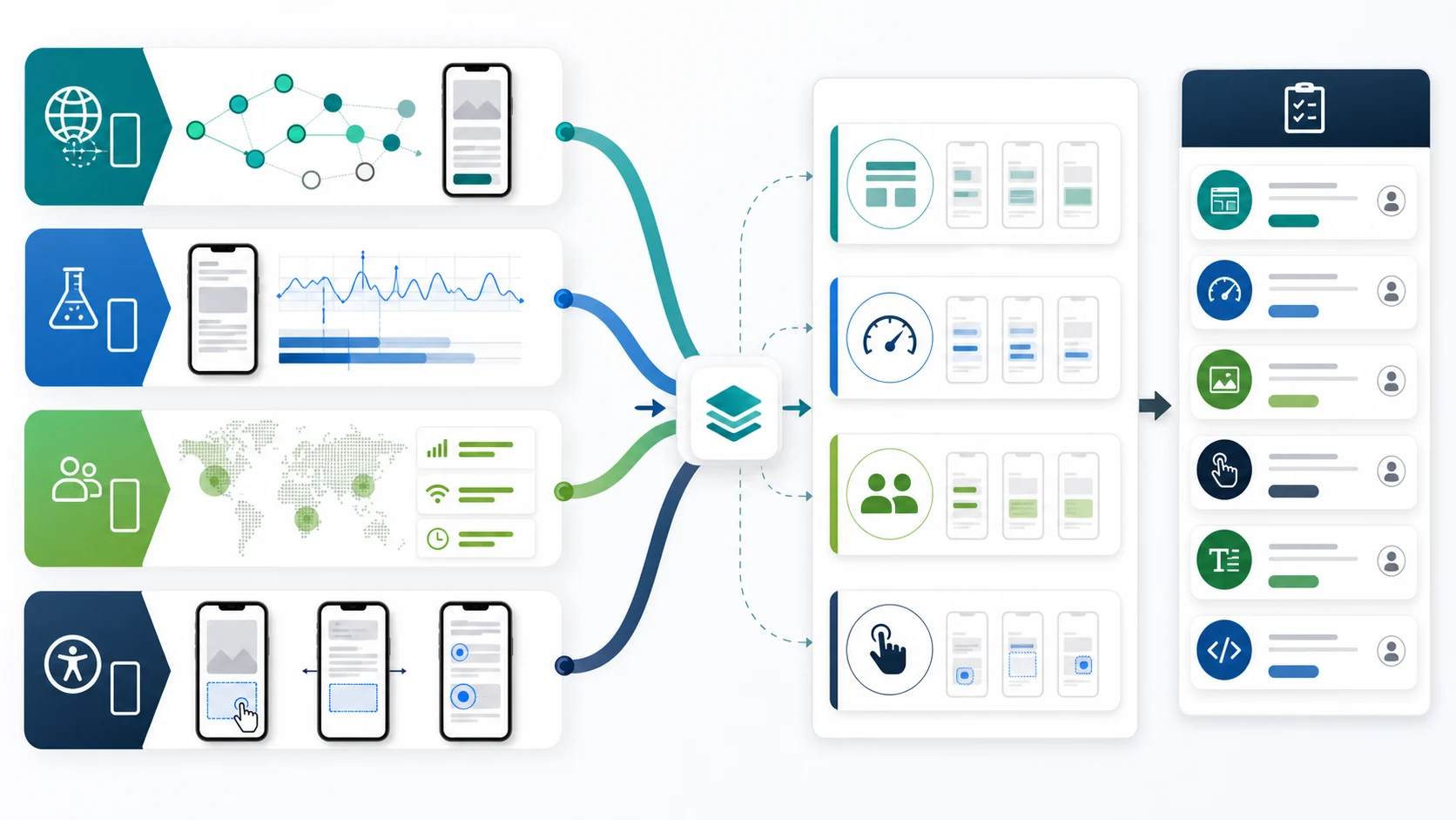
| Evidence layer | What it can show | What it cannot prove alone |
|---|---|---|
| Crawl and rendered-page evidence | Scope, status, indexability, template patterns, missing resources, content and link differences | Whether real people struggle with a control or flow |
| Lighthouse and other lab tests | Reproducible diagnostics under controlled conditions | The full range of real devices, networks, sessions, and interactions |
| Field data | What real visitors experienced over time | The exact component or code path that caused the problem |
| Manual accessibility and task checks | Reflow, touch, focus, zoom, forms, overlays, and task completion | Sitewide scope unless the sample is mapped back to templates |
Chrome describes Lighthouse as an automated auditing tool for performance, accessibility, SEO, and other quality categories. Use its failures as diagnostic leads. Do not treat a single run as a population measurement.
The web.dev field-and-lab workflow makes the distinction practical: lab tools run under predefined conditions, while field data reflects real-user experiences. When the two disagree, investigate the sample, device mix, network conditions, template, and interaction path before choosing a fix. The Core Web Vitals workflow goes deeper on that performance-specific diagnosis.
For accessibility, inspect more than an automated score. W3C guidance on reflow describes content adapting to a narrow viewport without losing information or functionality. Also test target size and spacing, visible focus, zoom, form labels, error messages, menus, dialogs, and sticky elements with real interaction.
Find the Problems That Repeat by Template
The highest-leverage mobile fixes usually live in shared components. Group findings before assigning them.
| Pattern | Evidence to capture | Likely owner | Validation |
|---|---|---|---|
| Horizontal overflow | Viewport width, overflowing selector, affected templates | Frontend or design system | Recheck narrow viewports and zoom states |
| Small or crowded controls | Control bounds, spacing, task path, repeated component | Design system and frontend | Repeat touch and keyboard task checks |
| Layout instability | Filmstrip or trace, unstable component, field trend | Frontend and performance owner | Lab rerun plus field monitoring |
| Mobile navigation gaps | Missing or unreachable links, menu state, crawl comparison | Frontend, UX, SEO | Mobile recrawl and task completion |
| Intrusive overlays | Trigger conditions, viewport coverage, close behavior | Growth, product, frontend | Test first visit, return visit, and consent states |
| Hidden or delayed primary content | Raw and rendered output, interaction requirement, affected pages | Frontend, CMS, SEO | Rendered recrawl and content parity check |
| Form friction | Input type, label, keyboard, validation, error recovery | Product and frontend | Complete the full mobile task on real devices |
Avoid tickets such as “improve mobile score.” A useful ticket names the component, template footprint, user consequence, owner, and acceptance test. If ten templates share one broken navigation control, fix the component once. If one article has an oversized table, repair the content pattern without launching a sitewide redesign.
Turn Findings Into an Owner-Ready Fix Queue
Prioritize each issue with four factors:
- User impact: Does it block reading, navigation, input, purchase, signup, or another important task?
- Template reach: How many search-important or conversion-important URLs inherit the problem?
- Evidence confidence: Do crawl, lab, field, or manual checks corroborate the diagnosis?
- Fix leverage: Can one component or template change remove the failure across many pages?
Use this handoff structure:
| Handoff field | What to record |
|---|---|
| Page group | Template, directory, locale, or component and sample URLs |
| User task | The action that becomes difficult or impossible on mobile |
| Evidence | Crawl fields, rendered output, lab trace, field segment, and manual reproduction |
| Root-cause hypothesis | The component, rule, resource, or content pattern most likely responsible |
| Owner | Design system, frontend, CMS, content, product, growth, or analytics |
| Acceptance test | Exact viewport, page state, interaction, and expected behavior |
| Validation date | When to rerun the lab check, recrawl, and review field data |
Keep cause and symptom separate. “Button is hard to tap” is the symptom. An undersized shared icon control with insufficient spacing is a possible cause. “Page shifts” is the symptom. A late-loading banner without reserved space may be the cause. Fixing the wrong layer often improves one screenshot while leaving the template failure intact.
Validate the Release With a Mobile Recrawl
Mobile usability work is not complete when a staging screenshot looks cleaner. Ship the smallest safe change, then retest the same sample and the full affected template group.
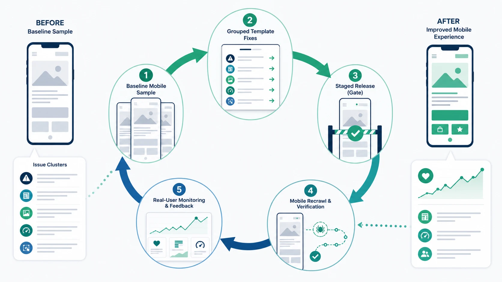
Run this loop:
- Save the baseline URL sample, viewport, lab settings, crawl fields, and manual reproduction steps.
- Group issues by component and template before implementation.
- Test the fix in the same state that failed, including menus, overlays, forms, and long-content cases.
- Release behind the normal QA gate or to a limited template segment when risk is high.
- Recrawl the affected mobile URLs and compare rendered content, links, resources, status, canonical, and indexability.
- Rerun the relevant lab diagnostics under the same conditions.
- Repeat the user task on real devices and accessibility input modes.
- Monitor field data and user feedback long enough to see whether the live experience changed.
If the recrawl is clean but field performance remains poor, investigate conditions the lab sample missed. If field data improves but the crawler still finds hidden links or content differences, the experience fix did not resolve the search contract. A broader technical SEO site audit can route those access and indexability problems to the right owner.
Where Searvora Fits
Searvora SEO Spider Crawler provides the inventory and technical evidence layer for this workflow. The current product surface supports crawl and rendering analysis, sitemap and robots discovery, URL inventory, indexability and canonical diagnosis, on-page QA, issue prioritization, owner-ready handoff, and repeatable validation crawls.
Use Searvora to map mobile findings back to page groups, find whether the same technical pattern repeats, and confirm that the released pages still expose the intended content and search signals. Pair that crawl evidence with Lighthouse, field data, accessibility checks, and real task testing; a crawler should organize the scope, not pretend to replace user evidence.
Mobile Usability Audit Checklist
Before closing the audit, confirm:
- The sample represents important templates, risky states, and healthy controls.
- Mobile-first indexing parity and mobile usability are evaluated as separate contracts.
- Crawl, lab, field, and manual evidence are labeled instead of blended into one score.
- Reflow, touch targets, focus, zoom, forms, navigation, overlays, and task completion were checked.
- Repeated failures are grouped by component or template.
- Every approved fix names the user task, owner, acceptance test, and validation date.
- The same mobile sample is retested after release.
- A mobile recrawl confirms content, links, resources, canonical, robots, status, and indexability remain correct.
- Field data or user feedback is monitored after the release.
A mobile usability audit succeeds when it produces fewer repeated barriers, not a prettier report. Use automated scores to locate evidence, connect that evidence to templates and user tasks, and keep the work open until the live recrawl and real-user signals support the fix.